


*All images and wordings in these designs are samples.
Colors
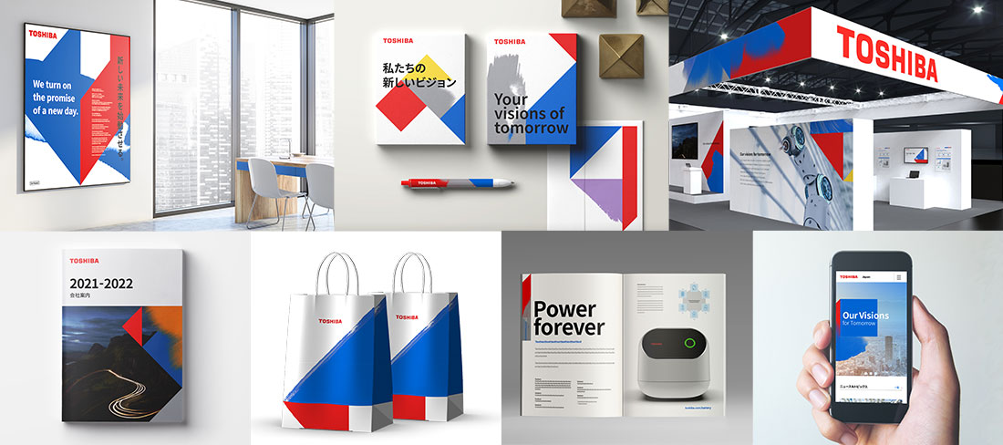
Red Represents Passion, Blue Intelligence
Toshiba Group has used red as its corporate color for a long time, and has now added blue. These primary colors are referred to as Toshiba Red and Toshiba Blue, and are the basic elements of Toshiba Group's visual system for communications.
Toshiba Red symbolizes Toshiba Group's unwavering passion and confidence. Toshiba Blue symbolizes intelligence and modernity. These vivid and powerful colors express Toshiba Group’s unchanging values and our flexible response to change.

Graphic motifs
Technical Ability and Creativity Turning on the Promise of a New Day
Graphic motifs symbolize the personality of Toshiba brand, which continues to respond flexibly to challenges and to adapt to changing times.
The geometric shape of the base represents the precision and accuracy of Toshiba Group's advanced expertise and technological capabilities. The textures of the hand-drawn touches humanize the motifs. The singular shapes this makes possible convey the humanity of Toshiba Group’s people, the powers of imagination that stir creativity, and a passion for the future.
The ability to create a wide range of graphic motifs by combining geometric shapes and hand-drawn touches brings flexibility to expressing Toshiba Group’s unique identity.

*All images and wordings in these designs are samples.
Brand Pictograms
Accented with isosceles right triangles
Brand pictograms can be accented with one or more isosceles right triangles, a component of the graphic motif that expresses the originality of the Toshiba brand in various media.

